Brand strategy
Packs — Brand Strategy & Visual Direction
A brand direction for a Los Angeles cannabis label — cultural research and visual strategy, aimed at a category whose marketing had defaulted to a narrow idea of its audience.
More from this body of work

Role note. Annalisse’s contribution here was brand strategy and visual direction. She did not write copy for Packs.
The brief
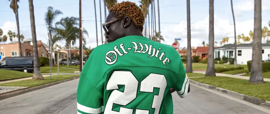
A moodboard for Packs, a Los Angeles cannabis brand, intended to resonate with the brand’s existing customer base while moving its marketing toward a more dynamic and professional footing.
The thinking
Three aims shaped the direction: challenging the male-centric stereotypes that dominate cannabis marketing, reflecting the cultural diversity of Los Angeles, and elevating the brand’s visual identity without losing its approachability.
The research
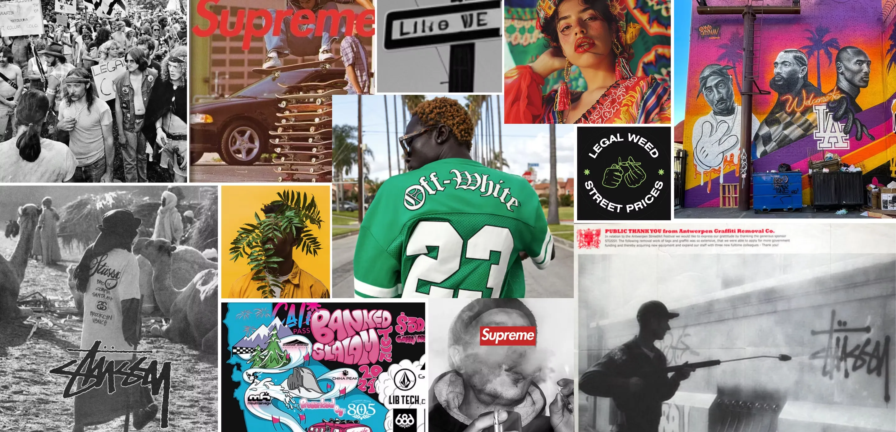
The direction was built from a set of keywords — diversity, boldness, vibrant colour, graffiti lettering, urban influences, street signs, city skylines, thrifted aesthetics, retro, skate and surf culture, abstract and surrealist art, and eco-conscious symbols.
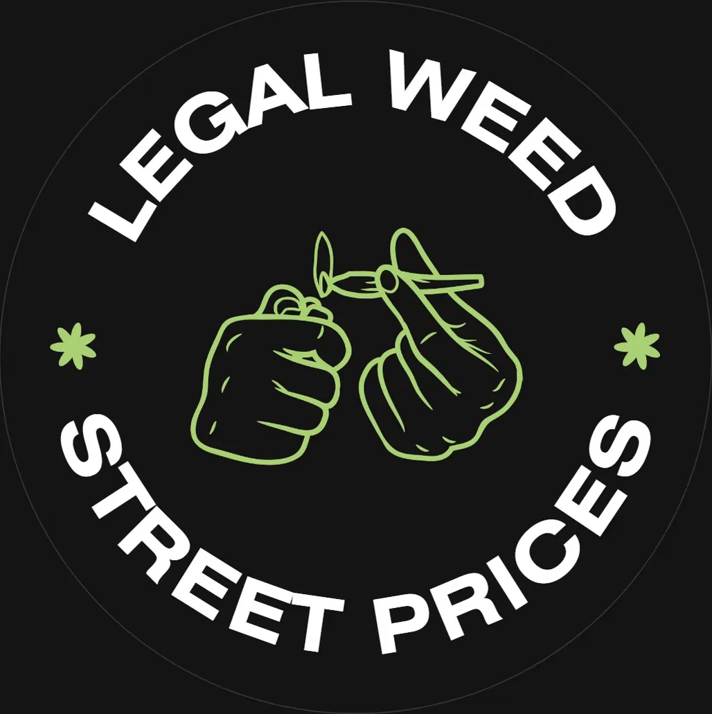
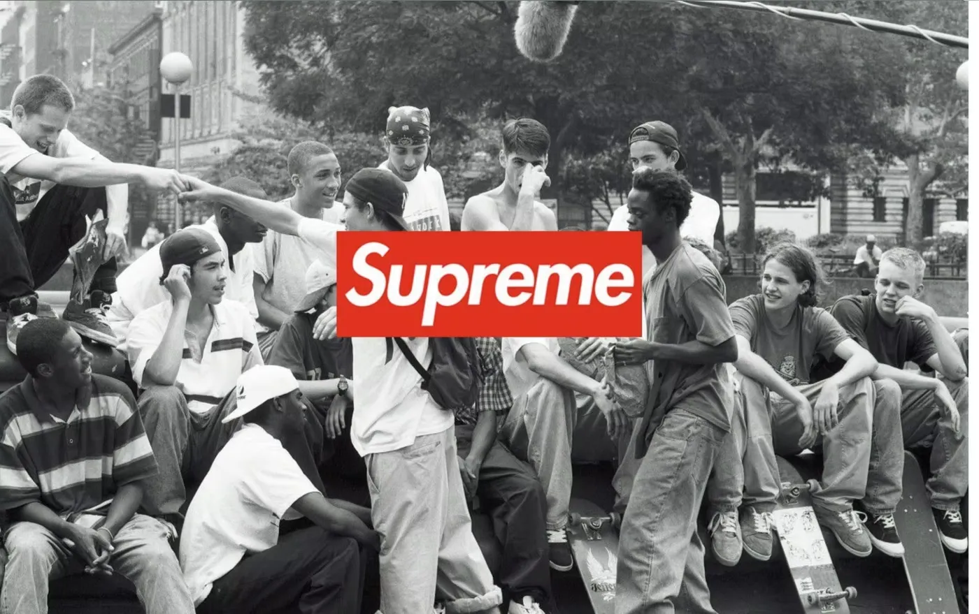
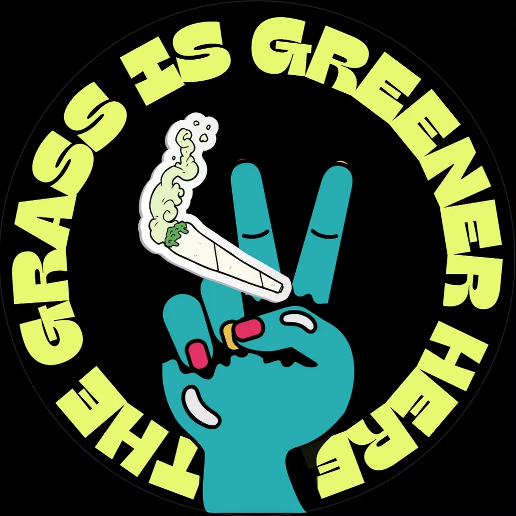
References ranged across Stussy and Off-White campaigns, a 1972 marijuana legalisation protest photograph, original graffiti-style sticker designs, Supreme advertising, portraits of women in cultural dress, street signage, celebrity street art, and abstract surrealist imagery.